Do Brand Colors Survive the Prompt? A Swatch Protocol for AI Image Models
Brand color is one of the few parts of a creative system that cannot be left to interpretation. Yet AI image models interpret color constantly. A prompt that asks for brand blue may return a navy, a cyan, or a saturated cobalt depending on the model, the lighting language, the material description, and even the output size. For studios in 2026, the risk is not that a model is wrong. The risk is that no one knows how wrong it is until the palette is already in a campaign.
A swatch-based stress test solves that problem. It does not require a color lab or a custom software stack. It requires a controlled set of brand references, a repeatable prompt matrix, and a clear definition of acceptable drift.
Color Names Are Not Specifications
Designers often describe color with names: brand blue, warm coral, forest green, sand. Models treat those names as semantic suggestions, not measurements. Even hex codes are not guaranteed to reproduce faithfully. The model may approximate the requested color or allow it to shift under the lighting and material conditions described in the prompt. A glossy surface may push a color toward white in the highlight, while a matte surface may read darker and flatter. Warm light can pull reds toward orange. Cool light can push blues toward cyan.
That does not make the models unusable. It means color behavior must be measured and documented. The goal is not to force a model to reproduce a hex code exactly in every condition. The goal is to know where it will drift, how far, and whether that drift is acceptable for the intended use.
Designing the Swatch Matrix
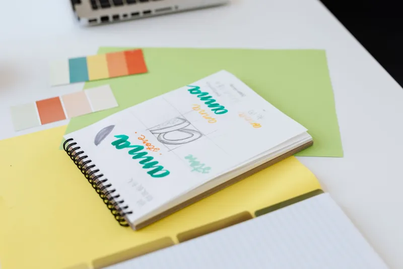
Start with five to eight colors from the brand guide. Include at least one critical brand color, two secondary colors, a neutral, and a background color. Record the sRGB hex value and, where relevant, the Lab value, Pantone reference, and CMYK build. The test should use the same color targets across every model and condition.
Build a matrix with four variables. The first is color input method: color name only, hex only, name plus hex, and a reference image if the model supports image prompts. The second is lighting: neutral studio light, warm tungsten, cool daylight, high-key, and low-key. The third is material: matte plastic, brushed metal, fabric, glass, and coated paper. The fourth is output format: square, portrait, and wide aspect ratios at standard and high resolution.
Keep prompts minimal and syntactically consistent. For example: A matte plastic surface in brand blue, neutral background, soft studio light. Change only the variable under test. Run at least three seeds per condition. Record the model name and version, the prompt, the seed, the output dimensions, and the date. If the model supports negative prompts or style controls, keep them constant unless they are part of the test.
Measuring Drift Like a Studio, Not a Lab
Export the images in sRGB and sample each swatch with an eyedropper. Take three to five readings per swatch, avoiding specular highlights and deep shadows. Convert the readings to Lab and calculate Delta E 2000 against the brand target. A spreadsheet is sufficient. The point is consistency, not laboratory-grade instrumentation.
Set acceptance criteria before the test begins. A practical starting point is Delta E of 2 or less for critical brand colors, 3 or less for secondary colors, and 5 or less for atmospheric or background colors. These are not universal laws. Packaging may require tighter tolerances than a social campaign. The art director should agree on thresholds in advance and document any exceptions.
Record hue direction as well as magnitude. A color that drifts two units toward green may be more objectionable than a color that drifts three units toward red, depending on the brand. Note whether the shift is consistent across seeds or erratic. Consistent drift can be corrected with prompt language or a post-production adjustment. Erratic drift is a reliability problem.
What the Results Usually Show
Across Seedream and peer models, several patterns tend to appear. Saturated blues often shift toward cyan under cool lighting. Warm lighting pulls reds and oranges toward yellow. Metallic materials increase contrast and can desaturate midtones. Glass adds a tint that is not present in the brand swatch. High-key lighting can wash out pastels, while low-key lighting can make dark colors indistinguishable from black.
Output size and upscaling usually affect edges more than interior color, but they can still change perceived saturation after sharpening. Always sample from the final delivered file, not only the preview. If the image will be converted to CMYK for print, run a second check after conversion. Some brand colors will move again, and some will fall out of gamut.
Acceptance Criteria Before Production
Create a color behavior log for each model in the studio workflow. The log should show which color language performed best, which lighting conditions caused the largest shifts, and which materials are safe for critical brand colors. Update the log when the model version changes. A model update can alter color behavior even when the interface looks the same.
Define three tiers of approval. Critical colors must pass the Delta E threshold across at least two lighting conditions and one production-relevant material. Secondary colors may pass with a documented adjustment. Background colors may be accepted with a wider tolerance. Any exception should require art director signoff and a note in the production file.
At Seedream 40, we recommend treating the swatch test as a gate, not a one-time experiment. Run it when a new model enters the workflow, when a brand palette changes, and when a campaign moves from screen to print. The test takes less time than a color correction cycle. It also gives the studio something more valuable than a lucky render: evidence that the palette will hold.