The Display Is a Variable: A Neutral-Viewing Protocol for AI Render Reviews
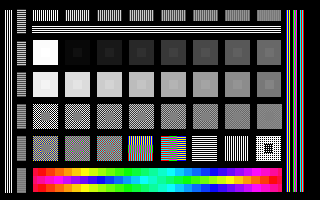
Photo: Nevit Dilmen, CC BY-SA 3.0, via Wikimedia Commons
An AI render does not arrive alone in the review room. It arrives with a display, a viewing distance, a browser, an operating system, and a set of automatic adjustments that may be helping or quietly rewriting the image. When a client rejects a skin tone or approves a gradient that later looks flat in production, the prompt is not always the cause. The monitor is part of the judgment.
For studios producing AI imagery, the review display deserves the same attention as the render settings. The goal is not to buy the most expensive panel in the building. It is to make the viewing condition stable enough that a decision about an AI image means the same thing on Tuesday afternoon as it did on Monday morning, and the same thing to the designer, the account lead, and the client.
Why the Review Display Belongs in the Approval Record
Most approval threads record the image file, the version number, and the date. Few record the display used to judge it. That omission matters more with AI renders because the models often produce subtle tonal transitions, synthetic skin, soft shadows, and low-contrast texture. These are exactly the areas where an uncalibrated display, an aggressive contrast setting, or a phone’s auto-brightness can exaggerate or erase detail.
A neutral-viewing protocol does not claim that every screen will match. It establishes a known reference. When a render is approved, the studio can say which display, profile, brightness level, and ambient condition were used. If a later dispute arises, the team can distinguish a change in the image from a change in the viewing environment.
Start With a Reference Room, Not a Reference Monitor
The room sets the range of useful display settings. A desk facing a window will produce different judgments at 9 a.m. and 4 p.m. even if the monitor never moves. For color-critical review, choose a space with indirect lighting, neutral gray walls, and no direct sunlight on the screen. Avoid reviewing AI renders under colored task lamps, near saturated wall paint, or in a room where the overhead lights are dimmed to a warm cast.
A practical baseline is a dim room with a bias light behind the monitor and no bright light source in the viewer’s field of vision. The screen should be the brightest object in the immediate area, but not a lamp. If the room cannot be controlled, note that in the approval record. A review conducted in a sunny conference room is not invalid, but it is a different viewing condition and should not be treated as equivalent to a controlled proofing session.
Check the Profile Chain Before the Image
An AI render may leave the model as an sRGB PNG, a wide-gamut TIFF, or a file whose embedded profile is missing. Before anyone judges color, confirm the chain from file to application to display. Open the image in a color-managed viewer, check the embedded profile, and verify that the operating system is using the intended display profile.
On macOS, the Displays settings and the ColorSync Utility provide the relevant checks. On Windows, the display profile and the color management control panel should agree. In browsers, color management behavior varies by browser and version. A render that looks correct in one browser may look more saturated in another if the display profile is being applied inconsistently. For approval, use a known color-managed viewer and, where possible, the same browser and operating system used in the final handoff.
This is also the moment to check for missing profiles. A file without an embedded profile is not neutral; it is undefined. Convert it to a known working space before review, and record the conversion.
Set Brightness to the Task, Not to Comfort
Monitor brightness is one of the most common sources of disagreement. A display set to 300 cd/m² in a bright office will make shadows look deeper and highlights look cleaner than they will in a dim proofing environment. A display set too low will flatten contrast and make synthetic noise look heavier than it is.
For soft proofing of print-bound work, a common target is around 120 cd/m² in a dim room, with the display matched to the viewing booth or proof light. For screen-first review, a lower office level may be acceptable, but it should be consistent across the team. The exact number matters less than the discipline of choosing one and documenting it. If the client will review on a phone at full brightness outdoors, that is a different condition and should be tested separately rather than treated as the studio reference.
Disable the Features That Guess
Adaptive brightness, True Tone, Night Shift, auto contrast, and ambient color adjustment are useful for reading and poor for judging renders. They change the image based on the room, the time of day, or the content on screen. Before a review session, disable these features on the reference display and on any device used for client approval.
Phone review deserves special caution. A modern phone screen can be excellent, but it is also a moving target: auto-brightness responds to the room, the color profile may shift with display modes, and the image may be scaled to a fraction of its intended size. If a client insists on phone approval, send a proofing note that describes the intended viewing condition and, when possible, provide a second check on a calibrated desktop display.
Test Gamut With Content the Model Actually Produces
AI renders often contain gradients, skin tones, and saturated accents that reveal gamut differences. A display that covers only sRGB will clip colors that a wide-gamut panel can show. A wide-gamut panel without proper color management can oversaturate an sRGB file. Neither result is a neutral judgment.
Use a test image that includes a smooth gray ramp, saturated primaries, and representative skin tones. Compare the same file on the reference display and on a second device. Look for banding in gradients, clipped highlights, and color shifts in neutrals. If the AI model outputs sRGB, review in an sRGB-managed context unless the project has a defined wide-gamut deliverable. If the project is destined for print, proof against the output profile rather than judging the render only on screen.
Record the Viewing Condition Alongside the Render
A short review note can prevent a long revision cycle. Record the display model, the profile used, the brightness setting, the application, and the ambient condition. Note whether the client reviewed on a calibrated display or a phone. This information belongs with the approved file, not in a forgotten chat thread.
When a render is rejected for color, compare the note with the current viewing condition before changing the prompt. The problem may be the display, not the model. If the condition has changed, re-review the same file under the original settings before commissioning a new generation.
A Short Pre-Sign-Off Checklist
- Confirm the room has indirect, neutral light and no direct sun on the screen.
- Verify the embedded profile and the display profile.
- Set brightness to the agreed level and disable adaptive features.
- Review in a color-managed viewer at final size and at 100%.
- Compare the reference display with one secondary device.
- Record the display, profile, brightness, application, and ambient condition.
- Re-check the approved file under the recorded condition before delivery.
The display is not a passive window. It is a participant in every approval decision. Treating it as a controlled variable gives AI renders a fairer hearing and gives the studio a defensible record when the next round of feedback arrives.